2ndNature
Digital Product Design
At A Glance
In a world where environmental consciousness is on the rise and the adverse impact of fast fashion is widely recognized, a growing number of consumers are making the switch to purchasing used clothing. Yet, amidst this transition, many individuals find themselves overwhelmed by the multitude of resale platforms and online second-hand marketplaces that saturate the digital realm.
2ndNature is an app crafted with a singular purpose: to empower and inspire shoppers to embark on a journey of sustainable fashion. Its mission is to redefine the way people shop for second-hand apparel, making the process not only seamless but delightful. I designed 2ndNature with the goal of making not only happier shoppers but also a happier planet.
Role
Product design
Product management
Timeline
6 weeks
Skills
UI/UX design, wireframing, user persona development, product management, usability testing, empathy mapping, Figma
💬 P.S. This was my first ever design project… skip to the bottom to read about what I learned and what I would change!
The Problem
With 2ndNature, users can effortlessly explore a world of second-hand clothing, discovering items that mirror the fast fashion pieces they seek, whether by searching for specific items or uploading photos for a personalized shopping experience
In a world overwhelmed by resale sites, shoppers need a seamless solution that simplifies the process of discovering second-hand clothing that perfectly aligns with their unique personal style.
While the appeal of sustainable and cost-effective shopping is clear, the process of sifting through so many sources can be a cumbersome and time-consuming endeavor. Shoppers face the challenge of needing to visit multiple websites, often with different interfaces and search functionalities, in their quest to find second-hand clothing that not only fits their size and budget but also resonates with their individual fashion preferences.
The Solution
2ndNature is a go-to app for second-hand shopping that seamlessly unites various resale platforms into a single, user-friendly hub.
Ideation
Who is facing this problem?
In order to understand who I would be designing for, I first needed to talk to them. I knew I wanted to talk to frequent shoppers who might be eco-conscious and budget-minded.
Luckily for me, a lot of my friends love to shop, so they became my interview participants. I sat down with three friends to understand their interests, motivations, needs, and goals. Some common themes I identified across my interview data were consciousness of a tight college student budget, a preference for name brands, and prioritization of convenience when shopping. With this information in mind, I created a primary and secondary persona.
Primary
Secondary
Brainstorming and wireframing.
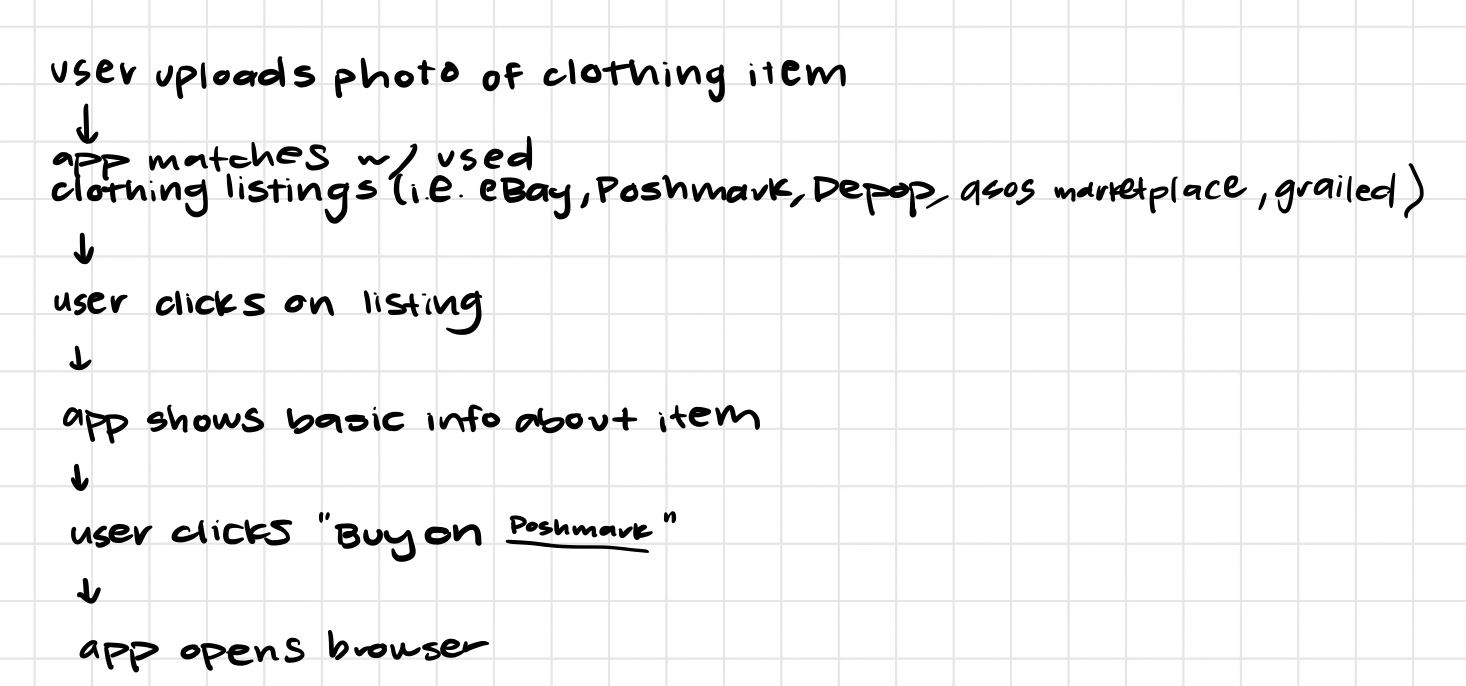
Next, I began brainstorming key features and user flows, which then inspired preliminary low-fidelity wireframes.
Does it work?
Once I had a working low-fidelity MVP prototype, I was ready to start usability testing to identify design inconsistencies, pain points, and usability issues. I asked 5 participants to go through the process of creating an account, searching for an item by uploading an image, and “opening” a product in a third-party app. These tests helped me identify dead ends in my flows and actions that were not intuitive to users. I used this feedback to improve my design during the final step of finalizing a high-fidelity prototype.
Final Product
I implemented user feedback and selected colors and typefaces to complete the final product.
Check out the prototype here.
If I could start over and do this project again, here’s what I would do.
I would take a different approach to my research.
In hindsight, I can see that my approach to user research could have been more insightful. Rather than using it as a tool to genuinely understand and address the needs of my target audience, I inadvertently treated it as a means to validate my preconceived design ideas. I was overly eager about the solution I had come up with, which led me to dive straight into discussions with interviewees about their opinions on the product itself, rather than delving into the core issues and challenges they were facing.
Key takeaways.
Fail faster.
Instead of investing so much time and commitment into an initial idea, it’s important to recognize your failures, and be honest with yourself when the solution you’ve come up with isn’t perfect. Doing this allows you to identify flaws and iterate early on in the process, allowing for a more user-centric design.Feature creep is real.
Given this was my first digital product design, I got excited about all of the possibilities for features and functionalities that I could add to the product, without identifying a clear purpose or direction for them. This project taught me to resist the temptation to take on too many features at once and streamline the product to meet its core value proposition.Get clear on your user.
Understanding the user is the most important part of this entire process. A designer should never design a product before understanding who is using it. It’s crucial to never lose sight of your user, and keep their behaviors, needs, and goals in mind during every single step.


